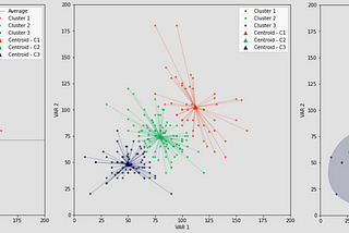
PinnedThiago CarvalhoinTowards Data ScienceVisualizing Clusters with Python’s MatplotlibHow to improve the visualization of your cluster analysis·9 min read·Jan 12, 2021--4--4
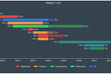
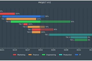
PinnedThiago CarvalhoinTowards Data ScienceGantt charts with Python’s MatplotlibA guide to visualizing project schedules with Python·5 min read·Aug 31, 2021--6--6
Thiago CarvalhoSQL Basics — Tables, Views, and Stored ProceduresUnderstanding the Differences between SQL Views, Stored Procedures, and Tables·4 min read·Jul 31, 2023----
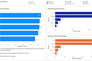
Thiago CarvalhoCreate Power BI reports in Jupyter NotebooksExploring the Synergy Between Power BI and Jupyter Notebooks·4 min read·Jun 4, 2023--1--1
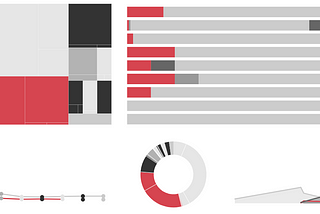
Thiago CarvalhoinBootcampMastering Data VisualizationSimplicity, User-Focus, and Practice as the Path to Success·6 min read·Jan 29, 2023--1--1
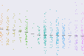
Thiago CarvalhoinTowards Data ScienceJitter plots with Python's SeabornA simple way of displaying distribution among categorical variables·5 min read·Aug 14, 2022--1--1
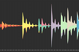
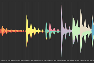
Thiago CarvalhoinTowards Data ScienceStream Graphs Basics with Python's MatplotlibThe good-looking cousin of stacked area charts·5 min read·Jul 25, 2022----
Thiago CarvalhoinTowards Data ScienceDynamic Axes with Field Parameters in Power BINo more workarounds to switch between measures·5 min read·Jun 20, 2022----
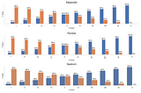
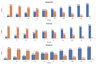
Thiago CarvalhoinTowards Data ScienceData Visualization with Matplotlib, Seaborn, and PandasKind of the same, but also different·5 min read·Jun 14, 2022----
Thiago CarvalhoEasier subplots layout with Python's MatplotlibHow to simplify one of Matplotlib's most tedious tasks·4 min read·May 31, 2022----