PinnedThiago CarvalhoinTowards Data ScienceVisualizing Clusters with Python’s MatplotlibHow to improve the visualization of your cluster analysisJan 12, 20214Jan 12, 20214
PinnedThiago CarvalhoinTowards Data ScienceGantt charts with Python’s MatplotlibA guide to visualizing project schedules with PythonAug 31, 20216Aug 31, 20216
Thiago CarvalhoSQL Basics — Tables, Views, and Stored ProceduresUnderstanding the Differences between SQL Views, Stored Procedures, and TablesJul 31, 2023Jul 31, 2023
Thiago CarvalhoCreate Power BI reports in Jupyter NotebooksExploring the Synergy Between Power BI and Jupyter NotebooksJun 4, 20231Jun 4, 20231
Thiago CarvalhoinBootcampMastering Data VisualizationSimplicity, User-Focus, and Practice as the Path to SuccessJan 29, 20231Jan 29, 20231
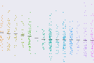
Thiago CarvalhoinTowards Data ScienceJitter plots with Python's SeabornA simple way of displaying distribution among categorical variablesAug 14, 20221Aug 14, 20221
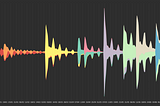
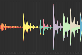
Thiago CarvalhoinTowards Data ScienceStream Graphs Basics with Python's MatplotlibThe good-looking cousin of stacked area chartsJul 25, 2022Jul 25, 2022
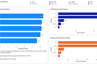
Thiago CarvalhoinTowards Data ScienceDynamic Axes with Field Parameters in Power BINo more workarounds to switch between measuresJun 20, 2022Jun 20, 2022
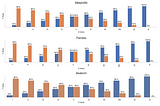
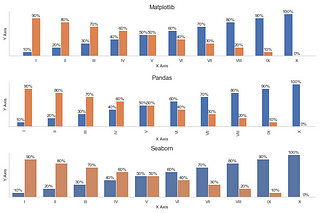
Thiago CarvalhoinTowards Data ScienceData Visualization with Matplotlib, Seaborn, and PandasKind of the same, but also differentJun 14, 2022Jun 14, 2022
Thiago CarvalhoEasier subplots layout with Python's MatplotlibHow to simplify one of Matplotlib's most tedious tasksMay 31, 2022May 31, 2022